WooCommerce is an ecommerce plugin of the most popular powering over 40% of the global ecommerce businesses. Whether you are planning to build your WooCommerce store or been around for a while, your end goal would be to boost your sales and improve your business revenue, isn’t it? There are multiple things you can do to achieve this for your WooCommerce stores like email marketing, social media exposure, and a ton of others but WooCommerce website design is the first thing you need to focus on your store. Let’s hop in. you dive in to try the other things.
To help you in your sales journey, we have gathered a few design tips and tactics for your WooCommerce store. Hop in!
1. Research on the WooCommerce store design that inspire you
This is the first step in your WooCommerce design journey. You can research and compile the list of the designs that have appealed to you. Do not copy! But find out the designs and layouts that are grabbing users’ eyeballs. You can prepare a list of all such designs and this could be one of the best learning techniques for you. See how they’ve designed their home page, landing pages, product catalogs, checkout process, and more. You can also collect the plugins that offer various functionalities to showcase to your customers.
2. An eye-catching Theme
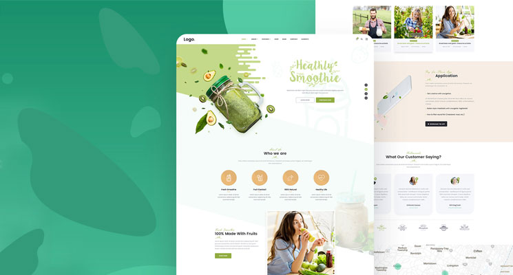
Your website theme and layout are the first things your website visitor sees. An eye-catching UI that is visually appealing and easy to navigate does wonder for your website. Your visitors should be able to interact with your WooCommerce store without any hassles. You need to pick the right WooCommerce theme for your store. There are a lot of both free and paid WooCommerce themes that help you create compelling UI. There are also custom WooCommerce themes available for you that suit your design and functionality needs. Make sure you provide a seamless experience to your customers.

3. Choose Your Homepage Layout wisely
A homepage speaks a lot about your e-commerce website. A customer who lands up on your WooCommerce store should be able to search for the desired product easily and the rest of the other things should be easier to consume. It should showcase your products in the best possible way to your customers with a proper hierarchy. So choose your WooCommerce homepage layout wisely. The layout should be clean and minimal, devoid of any distractions that are off-putting to your website visitors.
4. Easy Site Navigation
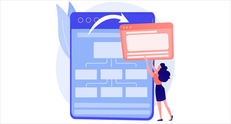
A well-designed WooCommerce website should also be easy to navigate. Your website visitors should be able to traverse through the pages and scroll through easily to find the information they have been looking for. Keep the overall website structure simple and minimal to enable easy navigation. Your navigation menus also should be clear and organized to guide the visitor. Do not clutter with multiple menus, instead go for a mega menu behind a drop-down menu for ease of navigation.

5. Legible Layouts
Visitor retention is the key to higher conversions. For that to happen, you need to have a seamless stream of customers who navigate to the other pages. You can have a consistent layout all over the website. The individual pages on your WooCommerce website include the shopping cart page, payment page, check out page. These are extremely vital to achieving the conversion rate you needed. A clean layout of these pages with less clutter reduces your cart abandonment rates.
6. Clear CTAs
It’s a no-brainer that without a proper and clearly visible call-to-action (CTA), your website visitors wouldn’t become your customers. Focus on the placement, color contrast, button size, of your call-to-action buttons like ‘Add to Cart’, ‘Buy Now’, ‘Sign up’, and others. These should be easy-to-finding for the customers for them to take appropriate action. They shouldn’t be lost in the chaos and layout clutter. The more time it takes to locate the CTA, the higher are the chances of user bounce rate.

7. High-quality Product Images
When a customer is buying through an online store instead of a brick-and-mortar store, the chances of distrust would be high. They would be reluctant to buy as it doesn’t provide the touch-and-feel experience which a physical store provides. The product images and video descriptions are the only things they have in front of them. So, choose high-quality images and videos that would give an apt description of the products. This also attracts more customers and convinces them to make a purchase. You can also check the WooCommerce plugins to include the optimized images and videos into your site.
8. Run A/B tests
You can design two variants of your website elements and see which one performs better through the A/B test. Run both the variants and see which one resonates the best with your customers. You can identify which is working better in terms of conversions. You can A/B test if you are adding new elements to your store and see how they are consumed by your customers. It may be a tad tedious but it will be worth the efforts and help you experience incredible sales.
Wrap-up
With these simple tips, you can embark on designing your WooCommerce store for better results. Remember, user experience is the heart and soul of your WooCommerce store and hence you need to pay heed to the design elements. Make your store user-friendly, easy to navigate, and clean interface. Plan everything to get qualified leads and make sales. Don’t forget that your motive is not just a one-time purchase, you need to keep the customers coming back to you to make repetitive sales. So, make sure you build an attractive, intuitive, and engaging WooCommerce store to achieve the results you dreamt of.
If you need help with the design aspects, you can take a look at our WooCommerce services and give us a shot. Our Web design team builds custom designs for your WooCommerce store to boost your sales and achieve your business goals.
Skynet Technologies understand better that your traffic is everywhere! So making your WooCommerce design services responsive to cross devices and varied browsers is our top-most priority. We extensively analyze both the visitor’s behaviour and the core features of the system to allow the accurate rendering of all the visual and functional aspects.


