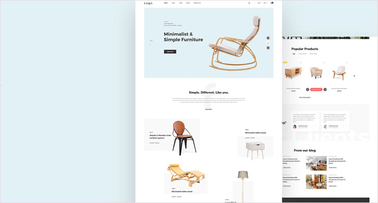
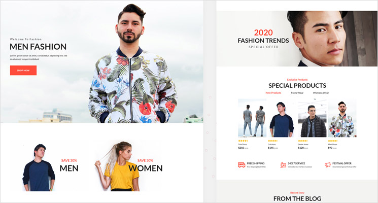
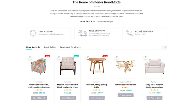
What is the first thing you, as a customer, notice when you visit an ecommerce store? Even before you view the products, it’s the design that plays a crucial role. A visually appealing web design leads the potential customers through your ecommerce store and even helps turn them into your buyers. When the website visitors can easily navigate through your store, find the products they have been looking for, quickly add them to the cart, and make the payments without hassles, then you better your chances of conversions.
BigCommerce is one of the best e-commerce platforms available and makes your ecommerce website stand out, owing to their attention to detail and features that are designed for conversions. However, no matter how much traffic your web store drives, if those visitors abandon your site without making any purchases because of poor web design, all your efforts go vain. Hence it is crucial to evaluate your store design and improve it before you channelize your efforts into other marketing aspects.
We present you with a few amazing design tips that will improve the aesthetics of your BigCommerce store and take it to the next level.
1. Clean and Clutter-free Pages

Every element on your BigCommerce store, from product images to navigation menus play a key role in the visitors’ behaviour on your website. You need to focus on keeping these pages clean and organized to improve the overall experience of your potential customers. When they are on your site, they should be properly able to differentiate the products, product types, and others. It shouldn't be messy and cluttered. There has to be some breathing room around each product item. Use a grid layout, properly label the product descriptions, and keep the overall page with minimal products.
2. Easy to navigate Menus
Menus are one of the important elements on your website. They help the customers traverse through your web pages. So, focus on providing an intuitive navigation structure on your BigCommerce store. Adding too many links in the main menu is off-putting. Opt for a drop-down that allows you to add additional links leading to your product categories. You can also use a fly-out menu that appears when you hover to facilitate the navigation around your website. Pick an appropriate BigCommerce theme that comes with pre-built menus and helps better the shopping experience for your potential customers.
3. Include a search bar
Your customers visit your ecommerce store with a product already in their mind. They are unlikely to spend time on your home page or landing page no matter how appealing they are. Their intent is to quickly find the product they are looking for and check the details out. If it becomes difficult to find, they will go somewhere else. So, don’t leave these things to the navigation menu when they don’t wish to wander from one product category to the next. Add a search bar to your BigCommerce website that is clearly visible.
4. Add High-Quality Images

The only way the customers would be able to decide to buy the products without touching them as in brick-and-mortar stores is by looking at the product images. These should be high-quality without any blurriness to convey how the product actually looks like. Don’t ruin the perception by adding low-quality images. Have a gallery and include the product images from several angles and display them on your website.
5. Mobile-Responsive
Optimize your store for mobile devices. Start with choosing a responsive BigCommerce theme that has all the requisite features like mega menus, product reviews, filtering options, and more. You can make sure that images scale nicely on compact screens without any fuss. Also, make use of the BigCommerce in-built features that enable mobile shopping and add appropriate payment options to your store.
6. Easy Filtering Options
Your customers should be able to filter through your products based on multiple criteria. This is a time-saving thing that will improve the overall shopping experience of your buyers. Easy filtering through the product pages is the best way to effortlessly find the desired products and save time. Some of the BigCommerce themes come with product filtering options that improve the overall store’s aesthetic.
7. Easy Checkout and contact pages
One of the biggest reasons for a higher cart abandonment rate is the long and tedious checkout process. Fortunately, BigCommerce has a built-in single page checkout that can boost your conversion rates. You can simplify the whole experience by letting them check out as guests as well. Customers should also be able to find the other options they are looking for easily. For instance, if they have questions about your product or payment methods, they need to be able to find your contact information and get in touch with you easily.
8. Product and Customer reviews
More than 2/3rds of the online buyers rely on customer reviews before they buy the product. They can help you increase conversion rates and drive more sales. It was proven that adding customer reviews could boost conversion rates by more than 5%. They should also be able to view the product reviews by simply clicking on any product. They should be able to see the product description, price, images, and other information when they hover on the products. They don’t have to click through the product pages. So, provide a quick view feature that enables an enlarged image and you can also add the product immediately to the cart.
9. Shipping and buying Options
One of the most important elements of your BigCommerce store is the Add to Cart or Buy Now elements. It should be easily visible and distinguishable from the other elements. Design this button carefully by using a contrasting color to make it stand out. It should be large enough to be visible so that your buyers can click without pinching or zooming. Also, another factor that contributes to higher cart abandonment rates is the shipping costs. Display them at the start only instead of pushing them to the very end. The customers should be able to see the final price of the product with shipping costs included in it.
10. Maintain Brand Consistency

Make sure to incorporate your branding elements into your BigCommerce store to make sure it stands out from your competitors. Your customers should be able to see your logo, theme, and other elements that remain consistent throughout your website. You can add your primary brand colors to elements like buttons, navigation menus, and links that keep the overall look consistent. By maintaining your brand elements consistent all over your web store, you can build trust in your customers.
Wrap-up
A great BigCommerce web design is extremely crucial for converting your website visitors into your actual buyers. It only establishes your brand but also builds trust. You can enable a smooth shopping experience for your customers on your website. If you need help getting started with your ecommerce web design, you can hit us up.
Skynet Technologies always on the edge of innovation. We have always exceeded the expectations of our clients by providing them UI/UX Web design, ADA compliant website design and development services to help you avoid legal battles and penalties. Our dedicated team is capable to handle simple to complex customer requirements on the BigCommerce platform and have created marvellous and responsive web designs. whether you are looking for new store, migrate an existing store or improve an existing BigCommerce store, Skynet Technologies is right place.
